Revit Tip: Easy Wall Poche
by Tim Alatorre
-
Posted on September 3, 2009
This is the first of what is hopefully many more Revit Tips to come. Something that I’ve seen in some projects I’ve worked on lately is using filled regions to poché walls and floors in section views. DON’T DO THIS! Besides taking a large amount of time to initially create, filled regions are not going to update as you add or remove walls, windows, etc. So how do you poché your walls? Easy.
There are two tools that you will use to make this happen, Visibility/Graphic Overrides and the Join Tool.
I think the reason that you would try to used filled regions to poché walls is because you don’t fully understand how Revit displays objects. Revit uses a hierarchy of graphic settings to determine what to display.
On the most general level are the project’s Object Styles. You reach these by going to Manage -> Settings -> Object Styles. I could write a number of essays on what you can do here, but right now we will just focus on the Walls category. The main walls category by default has 3 sub-categories. For these 4 category/sub-categories you can set the line weights/color/pattern for projection and cut views as well as the default material. This is where we could bump up the line weight for cut walls to make our elevations read clearer.
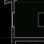
The category parameters are where you will want to define the defaults for your project. Materials definitions allow you to define a Cut Pattern. In a default project walls have no fill pattern, so in your section your walls will have a white fill when printed. If you had a masonry wall you might want the cut pattern to reflect that. Material patterns can be a lot of fun as I show in the screenshot to the right.
Revit offers a lot of control over what is displayed. So far we have just discussed project wide settings. The next level is view specific. Each view in Revit allows you to override these general settings. You might for example want your masonry cut pattern to display in a detail view or large scale sections, but for design presentations or small scale sections you want to override those patterns and show a solid color poché. That’s where Visibility/Graphic Overrides come in.
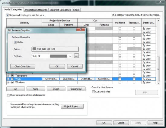
To access Visibility/Graphic Overrides use the key shortcut “VG” or right click and select View Properties, then edit V/G Overrides from there.
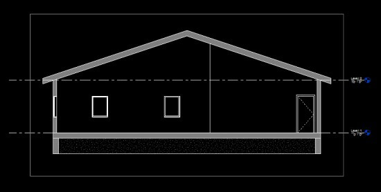
The V/G Overrides dialog looks like the Object Styles dialog except it has an extra tab “Filters.” (I’ll discuss filters in a nother post) Remember, the changes we make in the V/G Overrides dialog are specific to this view and Object Styles are the defaults for your entire project. This is where we can create our view specific poché. Click the Override under Cut -> Patterns then select a solid pattern fill and set the color for the fill.
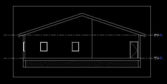
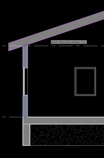
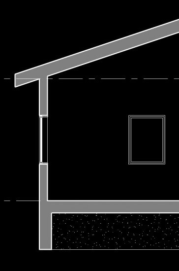
Now, we’re getting closer, but some designers like to have a monolithic look to their sections and not see the divisions between foundation, floor, walls, and roof.
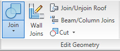
The Join Tool
This is an easy fix with the join tool!
There we go. This section is looking a lot better and it will update when move, add, or remove elements. The one thing that may require some touch up are our element joins. New elements will need to be told what to join with.
Don’t forget to save these settings to your view and project templates!
